Traeger Grills
Navigation Update
I have had the opportunity to restructure the site architecture for Traeger.com to ensure it met both business and customer needs. This led to a navigation redesign, making it easier for customers to shop, find recipes, explore the Traeger story, and access support.
Context
Updating the navigation would allow customers to easily shop, find recipes, explore the Traeger story, learn about wood pellet grills, and quickly access support for owners.
Problem
The Traeger navigation wasn’t organized in a way that was quick and easy to browse. We wanted to provide a visual and elevated way to research and buy the products they wanted.
Role
As the Sr. Designer, I led this project with support from the Director of Product and my Product Manager, along with two web engineers. I collaborated with 8 different teams of stakeholders to execute the final product.
The Why
Customer Needs
Be mobile-first in design
Make it easy for returning and new customers to find what they need
Offer the ability to intuitively filter (i.e. grills, accessories, recipes)
Tell our Traeger story & why WPG?
Educate our consumers on products
Quickly navigate owners to support
Business Needs
Provide a platform to highlight what’s new
Guide consumers to research products and shop local
Improve and optimize SEO
Highlight brand moments
With an updated design, provide an easier way to update content
Research & Internal Insights
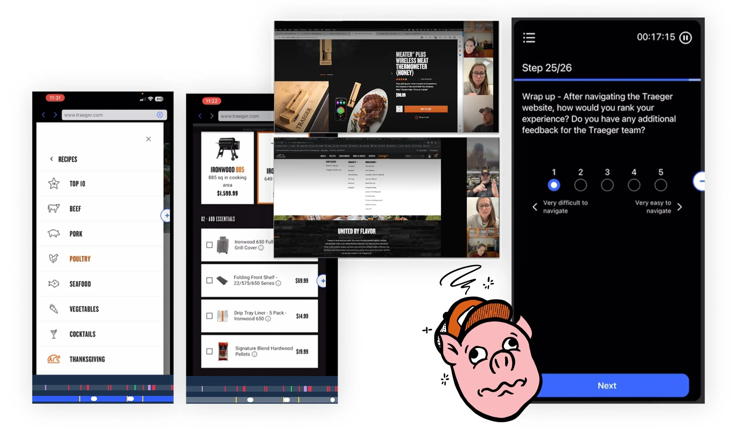
At the start of the project, interviews were held with 13 users (desktop and mobile) and 14 internal stakeholders across 8 teams. The external interviews used a mixed-method approach, combining card sorting with task-based usability tests on the current site navigation.
Round One Learnings
Categories were not intuitive
Content gets buried and difficult to find
Support is not obvious
Unclear taxonomy, and too many ”Traegerisms” for someone who is new to Traeger
Not mobile first
50% of the users interviewed rated it 2 or lower out of 5.
Synthesis to Concepting
With the first round of user testing complete, the learnings were compiled and presented to show what was potentially working, and other things to take into consideration. Overall, the testing was revealing but not surprising that the existing navigation and site structure was lacking, and making updates would lead to a much better shopping experience.
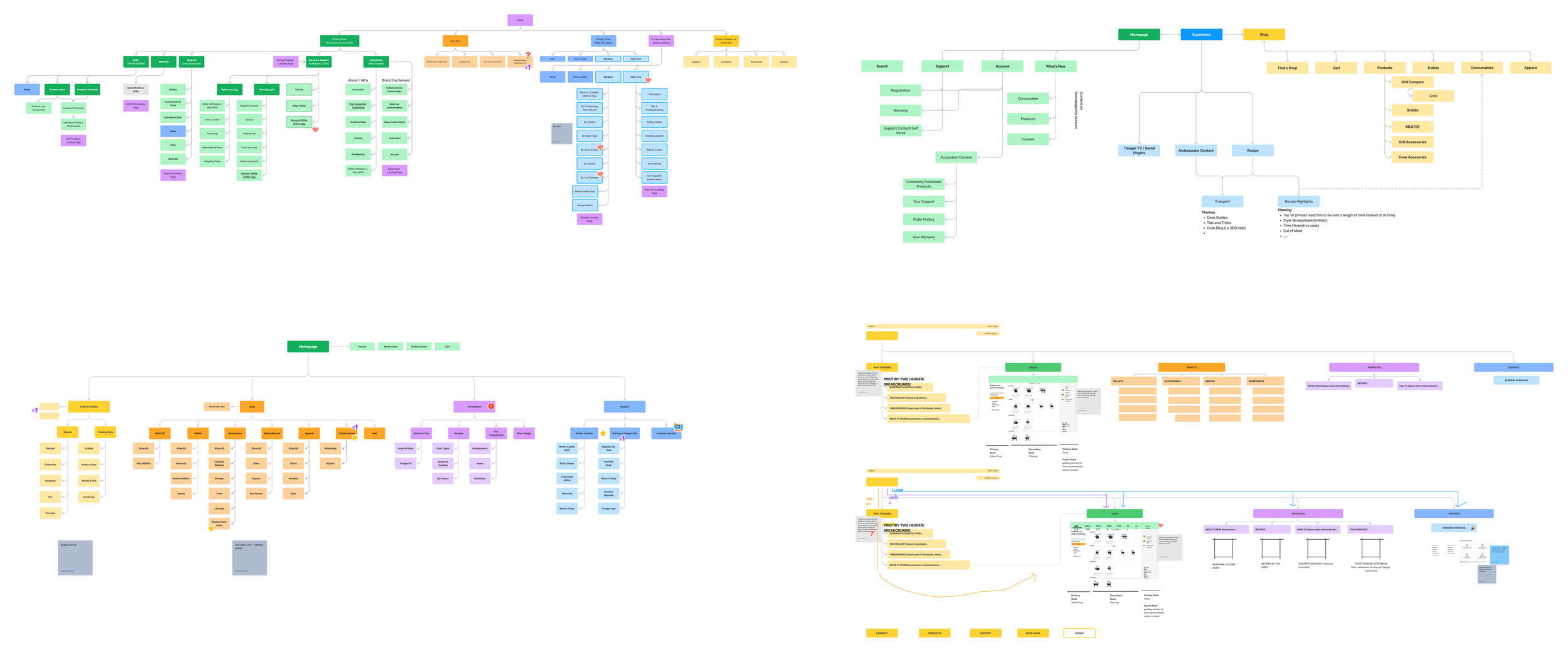
With the learnings gathered, we built out user personas, and then finished the initial week sprint by concepting different information architectures. Balancing the goals of the business but also making sure that the customer comes first.
Wireframes & Testing
Once the different information architectures were built, I worked with my team to build three potential navigation designs. We then chose one of the three to build out for a full prototyped experience.
We once again reached out to external users (both owners and non-owners) to go over a desktop and mobile prototype of the navigation. Using the same questions as before, they completed similar tasks and provided their feedback on the experience.
Round Two Learnings
After conducting another 12 user tests, we compiled insights to iterate and move to the visual design phase. Overall, the feedback was a vast improvement from the first round.
Overwhelmingly positive but with feedback that left room to improve
Keywords were: nice, good, simple, easy, superior, intuitive, helpful
“You feel like you’re at a good site that’s first class. It’s not a cheap site, and you feel reassured by looking at all the information.”
Visual Design
Taking feedback from the wireframe prototypes and stakeholder notes into consideration, we designed and prototyped out the desktop and mobile experiences with content and imagery flowed in.
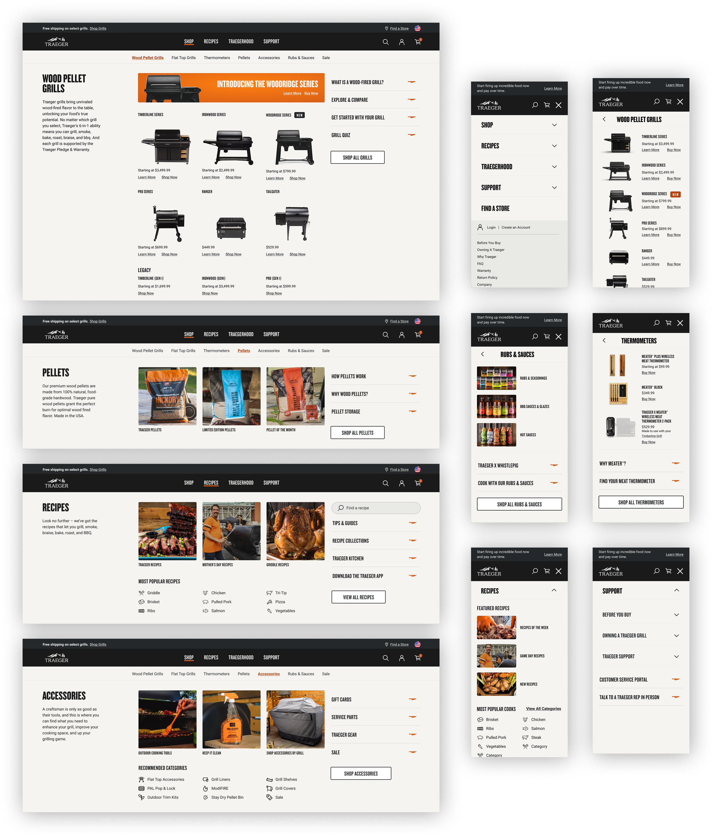
Final Designs & Testing
After the designs were completed, we ran one more test before launch. Completing the same tasks as the original test provided, it was clear that we had been able to solve the problems needed. A couple final takeaways were:
Users navigated both desktop and mobile with ease and were able to perform the same tasks with a much quicker pace
They also loved additions to mobile experience and found the terminology more straight forward than those in the previous tests.
7 of the 8 reviewers rated the revised experience a 5/5. The other rated it 4/5*
*Talk about a big improvement from 1/5 in the first round…
The End Results
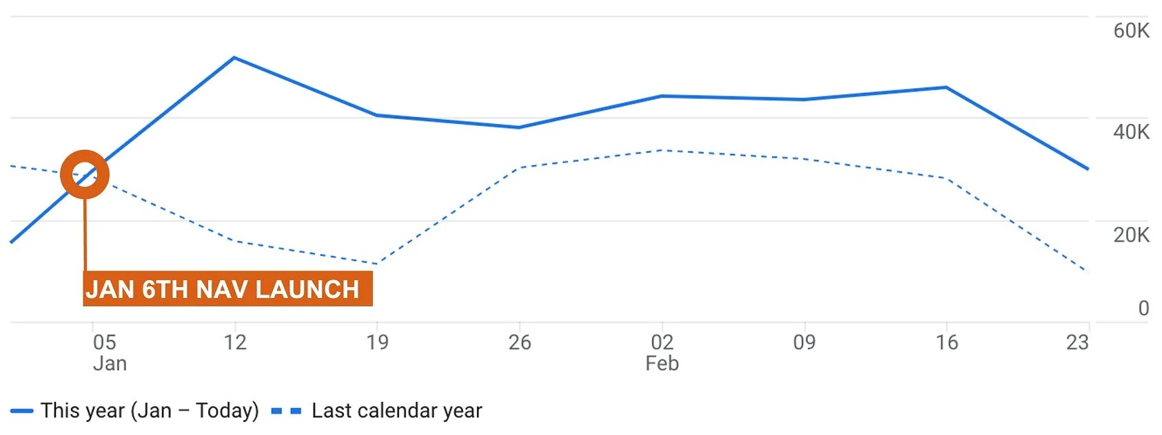
After launching the navigation, we have been tracking engagement through Segment, Google Analytics, and sales through SFCC. When comparing post launch to our numbers year over year, it was an instant improvement. Navigation interactions and users were up, and interactions with the navigation per user went down before purchasing. Which means we had an increase of users on our site using our new nav, but it took them less clicks to find what they were looking for and buy it.
338K ↑54.3%
162K ↑95.9%
2.1 ↓54.3%
Interactions Per User
Navigation Interactions
Navigation Users
Ready for Success
What are we looking for?
Based off of the initial response and increase in numbers on our site, we expect to see more of the following:
Drive users to product pages to convert
Decrease bounce rate
Increase session count
Decrease calls to customer service related to website usage
Built to test and iterate.
With the navigation running successfully and seeing stellar numbers, we now have the fun task of testing to iterate on existing content. I designed the navigation with changing seasons, campaigns, and new products in mind.
We will be able to test product titles, new internal linking paths, adding or removing category lists, and more to see what works best for our customers, and helps not only drive revenue, but also help grow the Traegerhood.
Let’s get cooking.
